

Have you noticed how the 1 page site is taking over the web in 2025? Fast, visually bold, and laser-focused, these streamlined sites are becoming the go-to choice for brands and creatives who want to make a big impact with just a single scroll.
In this guide, we’ll showcase the 7 best 1 page site examples that will spark your creativity and help you see what’s possible. You’ll uncover real-world designs, unique features, and clever strategies to boost efficiency, mobile performance, and conversions.
Ready to get inspired? Dive in and discover how these one page wonders can elevate your next project.
What separates an average 1 page site from a truly great one in 2025? It all starts with clarity. The best 1 page site experiences deliver a clear message within seconds, using concise headlines, focused copy, and a visual hierarchy that guides visitors seamlessly from start to finish.
A standout 1 page site is more than just a pretty scroll. It’s a carefully orchestrated journey, blending fast load times, mobile responsiveness, and compelling visual storytelling. Every section is purposeful, every element intentional.
Streamlined Navigation & User Experience
Navigation is the backbone of any effective 1 page site. Without clear pathways, users can feel lost in the scroll. Sticky menus and anchor links are must-haves, ensuring visitors can jump between sections with a single click. Smooth scrolling effects keep the experience fluid, not jarring.
Modern 1 page site builds also rely on logical sectioning — think hero, features, testimonials, pricing, and contact — to guide the user. A focused narrative, supported by a single, powerful call to action, keeps visitors engaged and moving toward your goal.
Design Trends: Visuals That Captivate
In 2025, design trends are bolder than ever. The best 1 page site examples leverage large, expressive typography to make statements and direct attention. Animations, parallax scrolling, and subtle microinteractions add a layer of polish and interactivity without overwhelming the senses.
Minimalism is in, with plenty of white space and carefully chosen color palettes. But there’s also room for playful creativity, especially in portfolios and event sites. Visual storytelling takes center stage, using images, videos, and illustrations to communicate brand values and product benefits instantly.
Mobile Responsiveness & Performance
With mobile browsing dominating the web, a great 1 page site must be fully responsive. Over half of all web traffic comes from smartphones and tablets — in fact, mobile devices account for 62.8% of global web traffic. This makes responsive layouts, scalable images, and touch-friendly elements non-negotiable.
Performance is just as critical. Fast load times are essential for keeping bounce rates low and conversions high. Optimizing images, lazy loading, and streamlined code all contribute to a lightning-fast user experience.
SEO & Conversion Power
A well-structured 1 page site actually holds several SEO advantages. With all content centralized, it’s easier to manage keyword strategy, optimize headings, and maintain site speed — all factors that search engines love. Single-page sites also reduce friction, making it simpler for users to convert. Whether it’s signing up, booking, or contacting, the journey is direct and distraction-free.
Use Cases: Portfolios, SaaS, Events, and Startups
The versatility of a 1 page site shines in specific scenarios. Portfolios benefit from immersive, linear storytelling. SaaS products and startups can present value, features, and pricing in one cohesive flow. Event pages use dynamic visuals and anchored CTAs to boost registrations. Even small businesses find 1 page site designs perfect for launching fast, focused campaigns.
To sum up, a great 1 page site in 2025 is clear, fast, visually captivating, and conversion-focused. It’s a blend of artistry and technical precision that delivers results — and inspires visitors to take action.
Looking for the best 1 page site inspiration for 2025? This listicle dives deep into seven standout sites, each a masterclass in modern web design. From SaaS powerhouses to creative portfolios and event pages, these examples show how a single page can deliver clarity, conversion, and visual wow—all while staying fast and mobile-friendly.
Whether you’re a designer, entrepreneur, or creative, you’ll see how each 1 page site excels through smart features, bold visuals, and focused storytelling. Let’s explore what makes each one unique and how you can apply their winning strategies to your next project.
Screen Studio sets a benchmark for the 1 page site experience in the SaaS world. Right from the hero section, visitors are greeted with dynamic embedded video demos that showcase the product’s capabilities in action. This approach instantly communicates value and keeps engagement high.
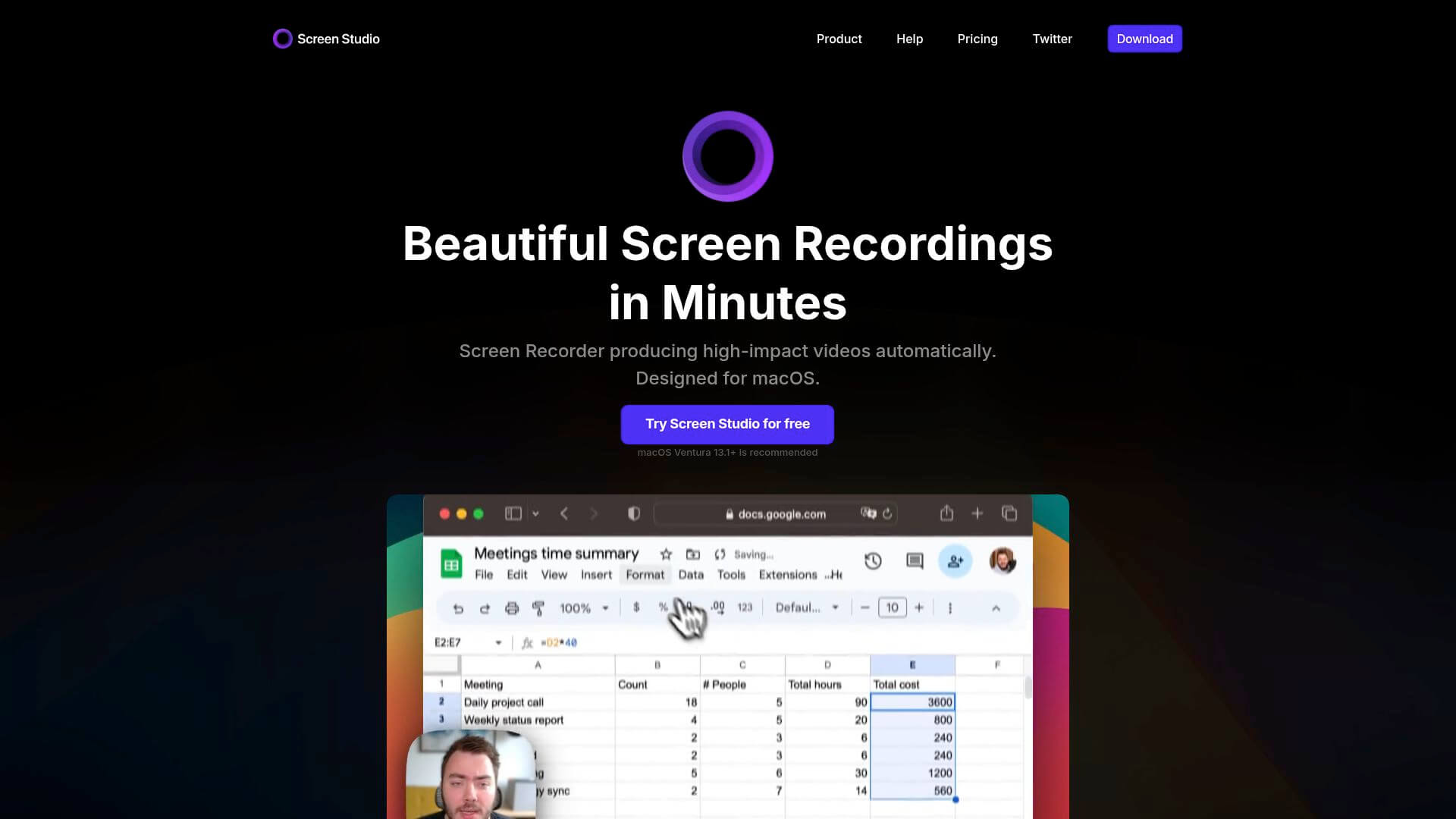
Pricing: Screen Studio offers a free trial, with paid plans unlocking premium features for advanced users. Everything you need to know about pricing, testimonials, and product features is right on the single page—no extra clicks required.
Core Features:
Key Benefits:
Target Audience: SaaS founders, product marketers, and tech startups seeking a high-conversion 1 page site that reduces friction in the buyer journey.
Pros:
Cons:
Unique Selling Point: Combines a minimalist, interactive design with all essential information in one place—making Screen Studio a poster child for the modern 1 page site.
Curious about creating a similar experience? Check out these one page website design tips for actionable strategies.
Artone Studio is a visual feast for anyone seeking a creative 1 page site. This digital portfolio uses interactive sliders, pop-ups, and carousel galleries to present high-res visuals that truly pop, giving visitors a sense of movement and energy throughout.
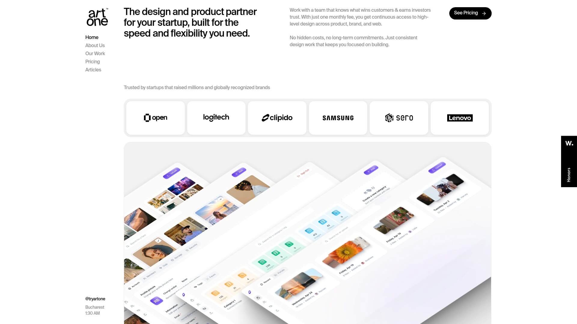
Pricing: As a portfolio, Artone Studio invites visitors to contact them for project quotes, keeping the focus on showcasing talent rather than selling products.
Core Features:
Key Benefits:
Target Audience: Creative agencies, designers, photographers, and studios looking for a 1 page site that stands out.
Pros:
Cons:
Unique Selling Point: Artone Studio’s 1 page site blends creativity with interactivity, making it a go-to inspiration for portfolios that need to wow at first glance.
Get Structure offers a masterclass in minimalist 1 page site design for SaaS and fintech. Its clean, pastel color palette and glass-like 3D elements create a sense of trust and professionalism, while toggle headers and organized content keep the experience frictionless.
Pricing: Custom SaaS pricing available upon inquiry, keeping the focus on lead generation and onboarding.
Core Features:
Key Benefits:
Target Audience: Early-stage businesses and startups needing a streamlined 1 page site for financial operations.
Pros:
Cons:
Unique Selling Point: Strikes the perfect balance between simplicity and professionalism, making Get Structure’s 1 page site a top pick for B2B SaaS.
We Ain’t Plastic is a bold 1 page site portfolio that makes a statement through full-screen visuals and a striking black-and-white theme. The site’s dynamic project displays and icon-driven service highlights set it apart in a crowded creative space.
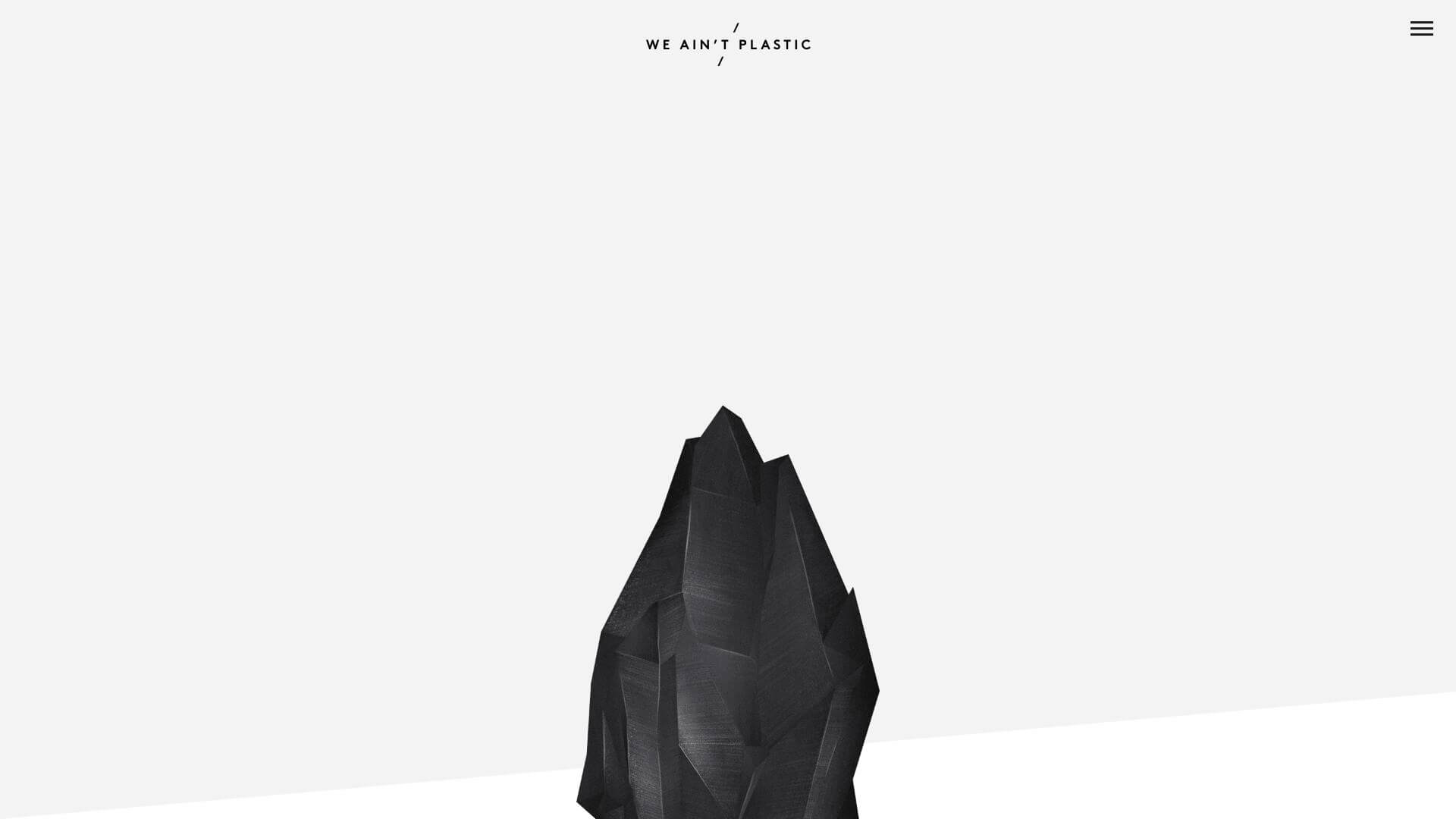
Pricing: Portfolio-based; no direct product or service pricing, focusing on showcasing work and expertise.
Core Features:
Key Benefits:
Target Audience: Artists, freelancers, and creative professionals seeking a unique 1 page site.
Pros:
Cons:
Unique Selling Point: An artistic, interactive approach to the 1 page site that’s perfect for making a lasting impression in creative industries.
ACID Event is a vibrant, energetic 1 page site built for event organizers and youthful audiences. Parallax scrolling and micro-animations create a lively atmosphere, while a dynamic navigation menu keeps everything accessible.
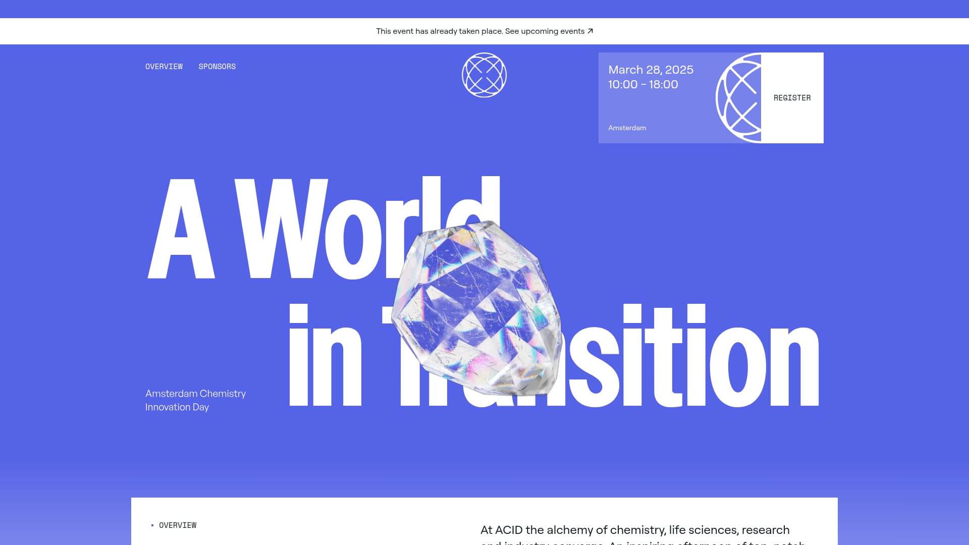
Pricing: Event registration fees apply; all details and sign-up are handled directly on the 1 page site.
Core Features:
Key Benefits:
Target Audience: Event planners, conference hosts, and students looking for an impactful 1 page site.
Pros:
Cons:
Unique Selling Point: Uses animation and color to turn a simple 1 page site into a memorable event experience.
Actor’s Portfolio demonstrates how a personal 1 page site can be both playful and professional. The use of bold color blocks and a clear visual hierarchy makes it easy for casting agents and collaborators to find exactly what they need.
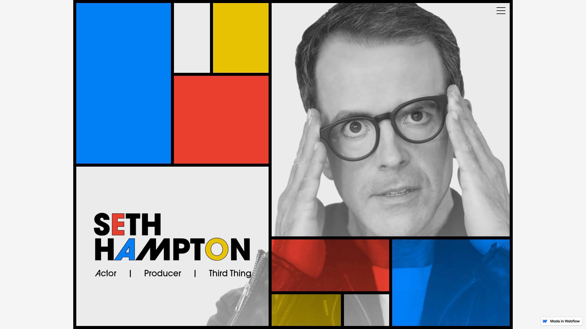
Pricing: Free Webflow cloneable; ideal for individuals needing a quick, standout 1 page site.
Core Features:
Key Benefits:
Target Audience: Actors, performers, and creatives who want a 1 page site that reflects personality.
Pros:
Cons:
Unique Selling Point: A bold, fun approach to the 1 page site that truly stands out in creative industries.
The Little Website Co. is redefining what a business 1 page site can be through custom design, top-tier speed, and eco-friendly builds. Their sites often load in under 0.5MB, making them both lightning-fast and sustainable.
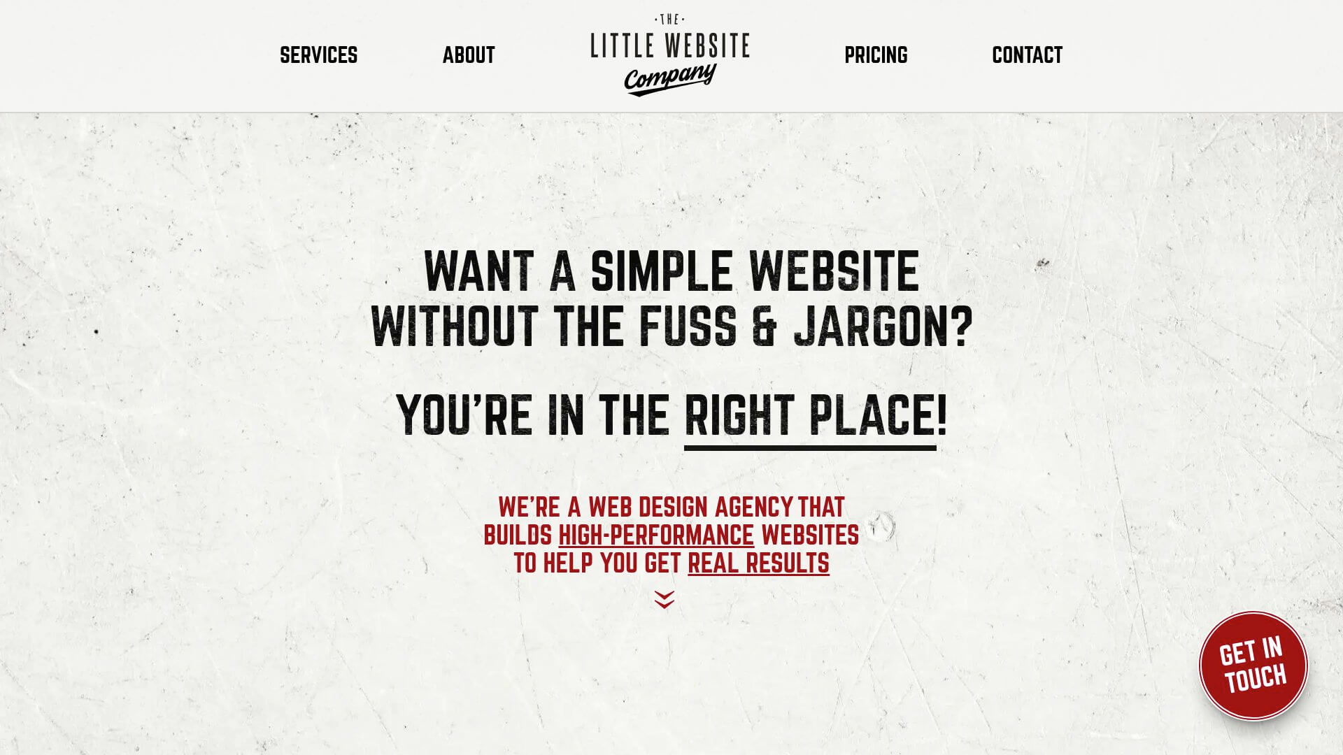
Pricing: Transparent pricing is available, with a free website audit for those considering a new 1 page site. The focus is on handcrafted solutions, not templates.
Core Features:
Key Benefits:
Target Audience: Small to medium businesses, startups, and entrepreneurs who need a high-performance 1 page site.
Pros:
Cons:
Unique Selling Point: The Little Website Co. brings together custom craftsmanship, speed, and sustainability, making the 1 page site accessible and powerful for businesses of all sizes.
Building an effective 1 page site in 2025 means blending clarity, interactivity, and speed into a seamless experience. Let’s break down the must-have elements that set standout single-page websites apart and help you create an engaging digital presence.
Your 1 page site should communicate its message instantly. Start with a bold, concise headline that tells visitors exactly what you offer. Use a consistent color scheme and branding throughout, so every section feels connected.
Organize your content into clear sections like About, Services, Portfolio, and Contact. Visual hierarchy—think larger fonts for titles, contrasting colors, and strategic spacing—guides users through your story. Actor’s Portfolio is a great example, using bold blocks and clear divisions to make navigation effortless.
Navigation can make or break a 1 page site. Incorporate sticky menus or anchor links, so users can jump to any section with a single click. Smooth scrolling keeps transitions feeling natural and engaging.
Microinteractions, like hover effects or subtle animations, add life without overwhelming visitors. Parallax scrolling, as seen on ACID Event, draws users in and keeps them exploring. Remember, a 1 page site thrives on simplicity, so every interactive element should serve the overall experience.
Speed is non-negotiable—sites under 5MB load best, and mobile users expect instant access. Responsive design ensures your 1 page site looks sharp on any device, from phones to desktops.
Image optimization and lazy loading boost speed. For more in-depth guidance, check out these Responsive web design essentials. The Little Website Co. shows how prioritizing performance and eco-friendliness can set your site apart.
A 1 page site needs a clear goal. Place your primary call to action (CTA) at the top, and repeat it subtly throughout the page. Use contrasting colors and action-oriented language to make your CTA stand out.
Effective CTAs guide users toward your desired outcome, whether that’s a sign-up, contact form, or purchase. Screen Studio’s “Try for Free” button is a textbook example—easy to find, impossible to ignore.
Don’t overlook search engines or users with different needs. Use structured headings (H1, H2, H3), descriptive alt text for images, and relevant keywords to boost SEO. Organized content and clear navigation help everyone enjoy your 1 page site.
Accessibility features—like proper color contrast and keyboard navigation—ensure no visitor is left behind. Get Structure’s streamlined layout and clear copy show how usability and SEO can work hand-in-hand.
The world of 1 page site design is evolving at lightning speed. In 2025, the most successful sites are embracing bold new approaches to aesthetics, usability, and performance. If you want your 1 page site to stand out, it pays to keep your finger on the pulse of these key trends.
Minimalism remains a dominant force, but it’s getting a modern twist. Designers are layering in glassmorphism—think frosted glass panels and translucent overlays—to create depth while keeping interfaces clean. Bold typography, vibrant color accents, and artistic chaos, like what Flayks does, are breaking the mold. 3D visuals and subtle parallax effects add a sense of motion and life. For more on these visual trends, check out Modern website designs: Trends and actionable tips for 2025. Incorporating these elements helps your 1 page site grab attention and communicate instantly.
Speed is non-negotiable. Over 50% of users expect a site to load in under 2 seconds. That’s why lightweight builds and image optimization are critical for every 1 page site. Eco-friendly design is gaining traction, with developers aiming to shrink digital carbon footprints by reducing file sizes and server loads. Mobile-first design isn’t just a nice-to-have—it’s essential, as mobile traffic continues to dominate. For actionable ways to boost your site’s speed and efficiency, explore these website speed optimisation strategies.
Interactive animations, microinteractions, and dynamic scroll effects are making every 1 page site feel more engaging. Users now expect smooth transitions, playful hover effects, and personalized experiences. AI-driven chatbots and recommendation engines are also being integrated to offer instant support and tailored content. These features not only delight visitors but can dramatically increase conversion rates. When planning your own 1 page site, think about how you can use interactivity and smart automation to create memorable, helpful experiences.
Inclusivity is at the heart of leading 1 page site designs. Structured headings, alt text for images, and keyboard navigation are standard best practices. Designers are also prioritizing color contrast and scalable fonts to ensure everyone can interact comfortably. As technology advances, expect even more integration of accessibility tools and adaptive interfaces. By embracing these trends, your 1 page site will be ready to reach and resonate with every user—today and tomorrow.
Choosing the perfect 1 page site template or designer can feel overwhelming, but breaking it down into clear steps makes the process much easier. The right choice sets the foundation for your brand’s online presence, so it’s worth a careful approach.
Start by clarifying your brand goals and target audience. Are you aiming for a portfolio, SaaS landing, event, or business showcase? Each 1 page site should reflect your unique objectives.
Think about the features you need. Will your site require interactive galleries, video demos, or a robust contact form? Scalability matters, too. If you anticipate growing content or complex needs, ensure your approach can adapt.
Pre-built templates offer speed and affordability, making them a good fit for tight timelines or budgets. They often come with built-in responsive design and basic SEO features. However, customization may be limited, and your 1 page site could resemble others using the same template.
On the other hand, custom design agencies deliver a tailored experience, unique branding, and the latest design trends. For inspiration, check out 2025 Web Design Trends and Best Practices to see how modern features can elevate your site. Custom builds are ideal for brands needing distinctive visuals or advanced functionality.
Ongoing support is essential for any 1 page site. Ask designers about maintenance, updates, and how they handle performance optimization.
SEO remains a priority even for single-page sites. Discuss strategies for fast load times, structured headings, and keyword placement. Make sure your designer has experience with 1 page site builds and understands best practices for mobile responsiveness and accessibility.
Prepare questions like:
Consider working with agencies like The Little Website Co., known for custom, high-performance 1 page site builds and transparent pricing. Before committing, take advantage of a free website audit for one page sites to identify strengths and areas for improvement.
Use this checklist when evaluating templates or designers:
| Criteria | Why It Matters |
|---|---|
| Responsiveness | Seamless experience on all devices |
| Speed | Fast load times boost engagement |
| Customization | Reflects your unique brand |
| SEO Optimization | Improves visibility and ranking |
| Track Record | Proven success with 1 page site builds |
| Ongoing Support | Peace of mind after launch |
Taking a strategic approach ensures your 1 page site delivers real results for your goals.
If you’re feeling inspired by these stunning one page site examples and are wondering how your own website stacks up—or where it could improve—you’re not alone! A fast, beautiful, and easy-to-navigate site can make all the difference for your audience and your business. Why not take the next step? Let’s see how your current site measures up and uncover some quick wins for performance, design, and SEO. You can grab a Free Website Audit to get expert feedback and personalized tips tailored just for you.
Let's chat...
Submitting Web Design Enquiry...