

Did you know the average web page now weighs over 2MB? This surge in size can slow your site, frustrate users, and even damage your SEO. As we head into 2025, mastering web design page size is more crucial than ever for creating fast, lean, and effective websites.
In this guide, you’ll discover why page size matters, current benchmarks, practical optimisation strategies, and the latest tools. Ready to boost speed, conversions, and rankings? Let’s dive in and help you master web page sizing for the year ahead.
The importance of web design page size has never been greater. As digital landscapes evolve, the size of your web pages can make or break your site's performance, user satisfaction, and even your business's bottom line. Let's explore why getting web design page size right is essential for 2025.

Web design page size directly impacts how quickly your site loads. When pages are heavy, users feel the lag instantly. Did you know that 53% of mobile users abandon a site if it takes longer than three seconds to load? That lost time translates to lost trust and fewer conversions.
For e-commerce, the stakes are even higher. Shoppers expect instant results. If your web design page size is too large, you risk frustrated users bouncing before they even see your products. Keeping pages lean is essential for keeping visitors engaged and satisfied.
Google and other search engines now prioritise sites with fast load times. A bloated web design page size can hurt your Core Web Vitals scores, which play a big part in search rankings. Sites that rank in the top ten search results typically keep their page size around 1.5MB or less.
Heavier pages often lead to lower rankings and less organic traffic. Optimising web design page size is a straightforward way to improve your site's visibility and attract more users through search.
With the majority of internet traffic coming from mobile devices, web design page size is a crucial factor in accessibility. Many users still rely on slower networks, especially in emerging markets. Large pages can make your site practically unreachable for these audiences.
A lighter web design page size ensures that everyone, regardless of their device or connection speed, can access your content. This inclusivity is vital for reaching a global audience and providing a consistent experience for all.
Few people realise that web design page size affects more than just speed—it also impacts the environment. Larger pages require more server resources and energy, increasing your website's carbon footprint.
By adopting sustainable web design page size practices, you help reduce energy consumption and promote greener internet usage. Every kilobyte saved contributes to a more eco-friendly web, aligning your brand with responsible digital practices.
Faster sites don’t just make users happy—they drive results. Studies show that improving web design page size can boost conversion rates by up to 70%. Retailers who trimmed excess page weight saw sales jump by 15% or more.
A streamlined web design page size means less friction for users, smoother checkout processes, and more completed transactions. The business case for optimising page size is clear: speed equals success.
The average web design page size has increased by 70% since 2017, with projections suggesting continued growth unless action is taken. For context, here’s a quick look at page size trends:
| Year | Average Page Size |
|---|---|
| 2017 | 1.2MB |
| 2024 | 2.0MB+ |
| 2025 | 2.3MB (projected) |
This rapid expansion is well-documented in resources like Webpages Are Getting Larger Every Year. Without proactive optimisation, sites risk falling behind in both performance and rankings. Keeping web design page size in check is your best defence against digital bloat.
Web design page size is more than just a number—it’s the sum of every asset, script, and pixel loaded by your website. Understanding what makes up this size is crucial for building faster, more effective sites in 2025. Let’s break down the anatomy of web design page size and see how you can measure, benchmark, and optimise it for success.
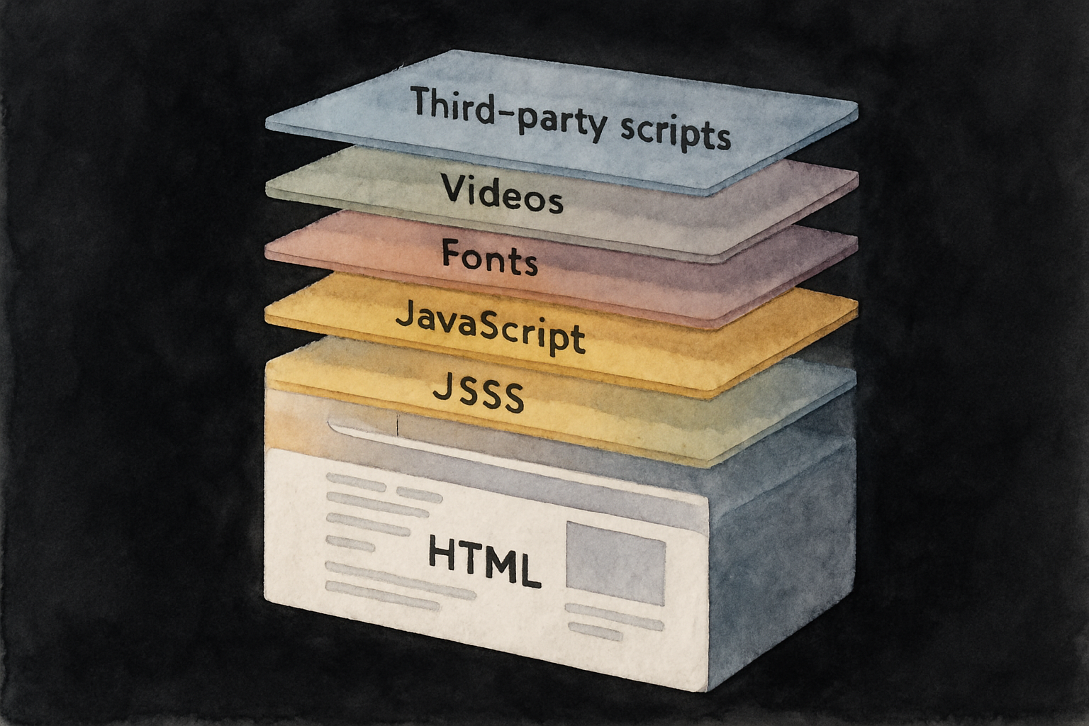
Web design page size is essentially the total weight of all assets a browser must load to display a page. Each component contributes differently:
Every time you add a plugin or upload a new image, you’re altering the web design page size. Monitoring these elements is the first step toward optimisation.
Knowing where you stand against industry averages is vital. In 2024, the average web design page size for desktop sites is about 2.0MB, while mobile sites average closer to 1.7MB. However, top-performing sites tend to be leaner.
| Site Type | Average Desktop Size | Average Mobile Size |
|---|---|---|
| News/Media | 2.4MB | 2.0MB |
| E-commerce | 2.1MB | 1.8MB |
| SaaS/Corporate | 1.7MB | 1.3MB |
| Informational | 1.2MB | 0.9MB |
For up-to-date trends and more detailed figures, check out these Web Design Statistics for 2025. Understanding these benchmarks is essential for keeping your web design page size competitive.
Uncovering what’s weighing down your web pages starts with the right tools. Popular choices include:
A simple way to get started is to paste your URL into one of these tools and review the resource breakdown. You’ll see at a glance which files dominate your web design page size. For developers, Chrome DevTools can also display network activity and resource sizes in real time.
Let’s put theory into practice. The BBC homepage typically sits at around 1.1MB, Amazon’s homepage is roughly 2.5MB, and Wikipedia keeps things ultra-light at just 0.6MB. These differences highlight how content type and design choices impact web design page size.
A leading SaaS company recently slimmed its homepage from 1.8MB to 1.2MB by compressing images and removing redundant scripts. The result? Faster load times and a measurable boost in user engagement.
So, what’s a good goal for web design page size in 2025? Experts recommend aiming for under 1MB for most sites, and under 500KB if you’re taking a mobile-first approach. The right target depends on your audience, content, and business needs.
Consider these factors:
Setting a clear target helps guide design and development decisions toward performance.
It’s easy to let web design page size creep up over time. Common culprits include:
Regular audits and mindful asset management are essential to prevent unnecessary weight. Keep your site lean and your users happy by addressing these pitfalls early and often.
Keeping your web design page size lean is no longer just a technical preference—it’s essential for user experience, search rankings, and sustainability. By focusing on best practices in every aspect of your site, you can achieve lightning-fast load times while delivering a polished, modern feel.

Images and media files are usually the largest contributors to web design page size. Start by converting images to next-gen formats like WebP or AVIF, which offer high quality at a fraction of the file size. Compress images using tools like TinyPNG or Squoosh, ensuring you strike a balance between clarity and speed.
Implement lazy loading for images and videos below the fold. For videos, consider hosting on external platforms and using lightweight thumbnails as placeholders. One e-commerce site reported a 60% reduction in image payload simply by switching to WebP and compressing assets.
srcset) for device-specific optimisation.Even small changes can make a dramatic difference to your web design page size.
Bloated code can silently drag down your web design page size and slow everything to a crawl. Minify your CSS, JavaScript, and HTML files to strip out whitespace, comments, and unnecessary characters. Remove legacy scripts and unused code, which often accumulate over time.
Bundle related scripts and stylesheets to reduce HTTP requests, and defer non-critical resources so they don’t block the initial page render. Inline critical CSS directly in your HTML for faster above-the-fold content delivery.
If you want to understand how these steps impact broader site performance, check out these Technical SEO essentials for a deeper dive into optimisation strategies.
Regularly review your codebase and dependencies, as even popular frameworks can add unnecessary bulk. Every byte saved helps your web design page size stay within best practice targets.
Fonts and icons, while visually important, can secretly inflate your web design page size. Limit yourself to only the font families and weights you actually use—don’t load the entire library “just in case.” Tools like Google Fonts optimiser can help you customise and subset your font files.
Switch from icon fonts to SVG icons, which are scalable, crisp, and far smaller. SVG sprites allow you to combine multiple icons into a single file, reducing requests and overhead.
font-display: swap in your CSS for faster perceived loading.Smart font and icon decisions contribute significantly to a streamlined web design page size.
Third-party scripts—analytics, chatbots, ad networks—can make up to 60% of your total web design page size if left unchecked. Audit all external resources and remove anything unnecessary or redundant. Every plugin or script should earn its place.
Load essential scripts asynchronously or defer them to avoid blocking rendering. Use a tag manager to control script loading and monitor the impact of each resource. Remember, every third-party addition has a cost, both in size and speed.
Prune ruthlessly to keep web design page size manageable and your site performing at its best.
Caching and Content Delivery Networks (CDNs) are your secret weapons for keeping web design page size impacts in check. By enabling browser caching, you ensure that repeat visitors don’t have to download the same assets on every visit. Set appropriate cache headers for images, scripts, and stylesheets.
A CDN stores your assets on servers around the globe, delivering them from the closest location to each user. This not only speeds up load times but also reduces the apparent page size for users on slower networks.
Smart caching and CDN use help your web design page size work for you, not against you.
Responsive and adaptive design isn’t just about screen size—it’s about serving the right assets to the right device, keeping your web design page size as small as possible for everyone. Use media queries to deliver appropriately sized images and resources.
Implement adaptive loading strategies, so mobile users aren’t forced to download large desktop assets. Test your site on a range of devices and screen resolutions to spot any unnecessary bloat.
By prioritising device-specific optimisation, you reduce your web design page size for every visitor, no matter where or how they access your site.
Even the best-optimised sites can see their web design page size creep up over time. Schedule regular audits using tools like Google PageSpeed Insights, GTmetrix, or WebPageTest. Track your page size and largest contentful paint (LCP) metrics to catch regressions early.
Automate performance monitoring in your development workflow, so you’re alerted to sudden increases in size. Document your optimisation strategies and share them with your team for consistency.
Ongoing maintenance ensures your web design page size remains lean, efficient, and ready for the demands of 2025.
Ready to tackle your web design page size for 2025? Let’s break down the process into actionable steps, making it easy to shrink your site’s digital footprint and boost performance. Whether you’re a seasoned developer or a business owner, this guide will help you create faster, lighter, and more user-friendly pages.

Start by understanding your baseline. Use tools like Lighthouse, GTmetrix, or WebPageTest to analyse your site’s resource breakdown. These platforms reveal which elements—images, scripts, or fonts—contribute most to your web design page size.
Look for unusually large files or an overload of scripts. Waterfall charts help you spot bottlenecks and see how resources load in sequence. Make a list of the heaviest offenders, so you know where to focus your efforts.
Tip: Repeat audits for both desktop and mobile versions, as differences in web design page size may be significant.
Images and videos are often the largest contributors to web design page size. Convert images to modern formats like WebP or AVIF to reduce file size without losing quality. Compress and resize images so they’re only as large as needed for display.
Remove unused media files from your server. For videos, host externally (like YouTube or Vimeo), use compressed formats, and display thumbnails instead of auto-loading files.
Implement lazy loading for below-the-fold media, ensuring assets load only when needed. This simple adjustment can significantly cut initial page weight.
Code bloat can quietly inflate your web design page size. Minify CSS, JavaScript, and HTML files to remove unnecessary spaces and comments. Combine files where possible to reduce the number of requests.
Audit your codebase for unused libraries, plugins, or legacy scripts. If you find old frameworks or redundant code, remove them. Defer non-essential scripts so they load after your core content.
Use a table like the one below to track which resources are critical, and which can be deferred or removed:
| Resource Type | Critical | Can Defer | Remove |
|---|---|---|---|
| Main CSS | Yes | ||
| Animation JS | Yes | ||
| Old Plugin | Yes |
Fonts and icons are often overlooked contributors to web design page size. Only load the font families, weights, and styles you actually use. Subset your font files to include just the characters needed.
For icons, switch from icon fonts to SVG sprites. SVGs are lightweight, scalable, and crisp on all devices.
Keep your font and icon strategy lean to avoid hidden page weight and speed up your site’s rendering.
Third-party scripts—analytics, chatbots, ad trackers—can quietly double your web design page size if left unchecked. Audit every external script. Ask yourself: Does this add measurable value, or is it just weighing down my site?
Remove redundant or outdated scripts. Where necessary, load non-essential scripts asynchronously or defer them so they don’t block rendering.
Pro tip: Use a tag manager to control when and how scripts load, keeping your site lean and efficient.
Caching and content delivery networks (CDNs) are essential for reducing repeat load times and ensuring global performance. Set up browser caching rules so returning visitors aren’t forced to reload unchanged resources, helping maintain a smaller web design page size.
Choose a CDN with edge locations near your audience to serve assets quickly, regardless of user location. This is especially important for media-heavy sites or those with a global reach.
Test your site after implementing caching and a CDN to confirm improved speed and reduced resource downloads.
After each optimisation, retest your site using the same tools from step one. Monitoring is crucial—web design page size can creep up over time as new features are added.
Set up automated alerts for page size regressions. Many CI/CD pipelines can integrate with performance tools to catch issues before they go live.
Regular testing ensures your hard-won improvements last, and your site remains fast and efficient for all users.
Performance is a team sport. Share your web design page size guidelines with everyone involved—developers, designers, and content creators. Teach best practices, and encourage a performance-first mindset.
Consider creating a short checklist or internal wiki. For ongoing results, refer your team to website maintenance best practices, ensuring your site stays lean and loads quickly year-round.
A culture of continuous improvement keeps your site ahead of the curve, ready for the demands of 2025 and beyond.
Staying on top of your web design page size is easier when you have the right tools at your fingertips. Whether you’re a developer, designer, or business owner, these resources can help you analyse, optimise, and maintain lean, high-performing pages for 2025.
Choosing the right analysis tools is vital for managing web design page size. These tools break down your site’s assets and highlight what’s slowing things down.
Using these, you can identify which resources bloat your web design page size and take targeted action.
Manual checks are helpful, but automation takes web design page size management to the next level. Integrate performance checks into your CI/CD pipeline to catch issues before they reach users.
Set up alerts for page size regressions, so you’re never caught off guard. Many tools offer APIs or plugins for automated testing, ensuring every deployment meets your web design page size goals.
Optimising images and assets is a game-changer for web design page size. Services like Cloudinary and Imgix automate image compression and responsive delivery. For manual tweaks, TinyPNG and Squoosh make compressing files a breeze.
Here’s a quick comparison:
| Service | Automation | Formats Supported |
|---|---|---|
| Cloudinary | Yes | JPG, PNG, WebP |
| Imgix | Yes | JPG, PNG, WebP |
| TinyPNG | No | PNG, JPG |
| Squoosh | No | Many |
Using these tools, you can dramatically reduce web design page size without sacrificing quality.
Fonts and scripts often sneakily increase your web design page size. Use Google Fonts optimiser or Font Subsetter tools to load only what you need. For bundling and minifying scripts, Webpack and Gulp are industry favourites.
By trimming unused fonts and scripts, you’ll keep your web design page size in check and your site lightning fast.
Staying informed is crucial for future-proofing your web design page size strategy. Read guides on UX optimisation strategies to understand how page size impacts user experience and engagement.
Explore reports like Website Load Time Statistics 2025 for up-to-date data on how web design page size affects SEO and user behaviour. Knowledge is your best tool for continuous improvement.
The world of web design page size is moving faster than ever. As we look to 2025 and beyond, a host of new trends are shaping how designers approach performance, sustainability, and user experience. Let’s explore what’s on the horizon for web professionals who want their sites to stand out.
Sustainability is taking centre stage in web design page size conversations. Designers are now prioritising eco-friendly practices, aiming to create sites that load faster and use less energy. Cutting down on heavy assets not only improves speed but also helps reduce the carbon footprint of every visit.
Regulations and consumer expectations are pushing brands to adopt greener digital solutions. Many teams now set carbon budgets alongside performance budgets, making lightweight design a competitive advantage.
AI-driven tools are revolutionising how we manage web design page size. New platforms automatically compress images, optimise code, and even predict which resources a user will need next. This means less manual tweaking and more consistent performance gains.
Predictive loading, smart caching, and automated audits are quickly becoming part of the standard toolkit. As these technologies mature, expect even more sites to deliver lightning-fast experiences with less effort.
The evolution of web standards directly impacts web design page size. Protocols like HTTP/3 and QUIC are streamlining data transfer, making sites quicker to load globally. Next-generation image formats, such as JPEG XL and updated AVIF, are enabling higher quality visuals at a fraction of the size.
Developers are also benefiting from more efficient frameworks and smarter resource loading. These advances help ensure that even feature-rich sites stay lean and responsive for all users.
Lightweight web design page size is closely tied to accessibility. Sites that load quickly are more usable for people with disabilities and those on slower connections. Legal requirements and ethical considerations are pushing designers to create experiences that work for everyone.
Accessible, fast-loading websites are no longer optional—they’re expected. Prioritising performance helps close the digital divide and ensures no user is left behind.
Minimalism is making a comeback, with designers embracing content-first layouts and fewer distractions. By stripping away excess, sites become easier to navigate and much faster to load. This approach often means tighter control over web design page size.
For those looking to optimise further, understanding the most common device resolutions can help tailor assets for modern screens. The Website Dimensions & Screen Resolutions Guide 2025 is an excellent resource for making smart, size-conscious decisions.
Looking ahead, experts predict that the average web design page size will continue to rise unless teams act decisively. Performance budgets are expected to become standard in project planning, keeping growth in check.
Key predictions include:
Staying ahead means making web design page size a core part of your strategy now.
Now that you know just how much web page size can impact your site’s speed, SEO, and even its eco-friendliness, it’s the perfect time to see how your own website measures up. If you’re curious about where you stand and want tailored, actionable advice, why not take advantage of a Free Website Audit? We’ll help you spot quick wins and bigger opportunities, so you can create a faster, leaner site that stands out in 2025—no strings attached. Let’s make your website work smarter, not harder!
Let's chat...
Submitting Web Design Enquiry...